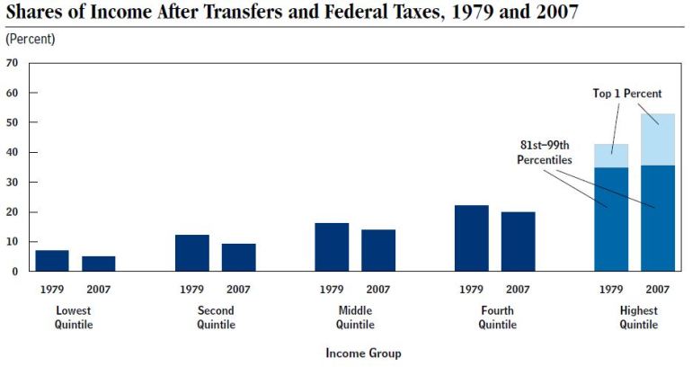
The Congressional Budget Office has a new report on trends in the income distribution. The big news is the 1%’s blitzkrieg assault on equality.
But it’s not just another rehash of Census numbers. Two adjustments they made seem especially good. First, they used a tricky matching method to combine Current Population Survey numbers (which do better at benefits and low-income households) combined with Internal Revenue Service data (which is better for high-end data). Second, they adjusted for household size and composition, and calculated distributions before and after taxes and transfers, and among different kinds of income.
The headline is the changing share of after-tax-and-transfer household income. Every group except the top 1% had a smaller share of income in 2007 than they did in 1979, or just an equal share in the case of the 81st-99th percentile group. That means the top quintile’s whole gain came in the top 1%.
 That is very important. A source of outrage for the hundreds of thousands of Facebook users posting, commenting, or Liking Occupy Wall St. and its related pages.
It would be misleading, however, to view the chart as showing that incomes fell for the other groups. Income growth has been very skewed toward the top, but it is by no means confined to the top 1%. Here is my graph showing the income cutoffs for each quintile, and for the top slices separately. These are the bottom cutoffs in 1979 and 2007 (in inflation-adjusted dollars), with the percentage change in the backgrounded bars.
(Note there is no cutoff for the bottom quintile — the price of entry for that group is always $0).
Two thoughts about this.
1. Even if there were no 1%, if the graph only included the green bars, there would be plenty of increasing inequality for what might then be called “the 80%” to protest. The 81st-99th folks may be lucky to have the popular anger directed at the grotesque opulence of the sliver above them. (I’m not diminishing the 1%’s income gains, but as Matt Taibbi pointed out yesterday, the object of opposition is not just their income, but their influence.)
2. If you look at the families and networks of the top 1%, how many of them have relatives, friends, and even co-“workers” who are only in the top 10%? Would a self-respecting 1% family be appalled if their son married someone from a stable 5%-er family?
What I’m wondering is whether the 1% folks are merely a statistical convenience rather than a socially cohesive group (class?). That’s an empirical question that national income distributions can’t necessarily answer.
The CBO report is here, a summary is here, and the blog post version is here.


The Weekend WSJ ran this article claiming that incomes at the top were highly volatile, especially in booms and busts. “The average price of a Gulfstream V tumbled from $45 million to about $23 million during the latest recession, while sales volume fell by nearly half. Similar patterns show up with racehorses, yachts and multimillion-dollar vacation homes. The butler shortage of 2007 became the butler glut of 2010.” Times are tough.
Today’s 1%-er might be only at the 95% level next year, and that possibility might affect networks. But wouldn’t that be a great study? In the movies, the guy who rises to great wealth cuts his ties with his former colleagues a step or two below him and hobnobs only with those of similar wealth. Then when he falls he sees the error of his ways. But what has happened in real life?
LikeLike
In real life, I believe there is a widening gulf between the top 1% and the 5%-ers. This just from anecdotal evidence. For one thing, remember that the incomes of the few range widely — not very many are anywhere near $250,000 / year, and I’d venture that the bulk of them would consider that amount very near poverty.
The richest tend to be very concerned with status, and relative standing. The difference between $5M and $10M, which might not concern you or me too deeply, is something to make them cross to the other side of the (speaking figuratively) cafeteria.
LikeLike
I bet you’re right about their attitudes, but when it comes to marriage, for example, I wonder how often they have to settle for a 5%er. Or, maybe they rebel a little and go into international development finance instead of toxic assets trading, and along the way also defy their parents by wooing a 5%er they met at a party with kids from the other side of the golf course.
Aside: I just picked up the latest edition of Domhoff’s Who Rules America, and realized that for years and years he’s been saying the ruling class is about 1% of the population. I still really like that book.
LikeLike
I’ve never much cared for household income as a measure of trend in inequality, because it’s polluted with too much other stuff. How much of that 39% growth (over 38 years, whee!) in the cutoff point to get into the 4th quartile is due to the increasing prevalence of dual career couples? How much of that increase in annual income at the 4th income quartile is due to individual workers, especially in professions and management, putting in longer work weeks, whether “voluntarily” or “involuntarily”? How much would the threshold between the 1st and 2nd income quartile have shifted if the proportion of single parent HH was the same in 2007 as in 1979? Etc.
(No, I’m not expecting you to answer these questions. If I *really* wanted to know badly enough, I could go crunch the numbers myself.)
LikeLike