Trying to summarize a few historical trends for the last half century (because what else is there to do?), I thought of framing them in terms of diversity.
Diversity is often an unsatisfying concept, used to describe hierarchical inequality as mere difference. But inequality is a form of diversity — a kind of difference. And further, not all social diversity is inequality. When people belong to categories and the categories are not ranked hierarchically (or you’re not interested in the ranking for whatever reason), the concept of diversity is useful.
There are various ways of constructing a diversity index, but I use the one sometimes called the Blau index, which is easy to calculate and has a nice interpretation: the probability that two randomly selected individuals are from different groups.
Example: Religion
Take religion. According to the 2001 census of India, this was the religious breakdown of the population:
| RELIGION | Number | Proportion |
| Hindus | 827,578,868 | .805 |
| Muslims | 138,188,240 | .134 |
| Christians | 24,080,016 | .023 |
| Sikhs | 19,215,730 | .019 |
| Buddhists | 7,955,207 | .008 |
| Jains | 4,225,053 | .004 |
| Others | 6,639,626 | .006 |
| Religion not stated | 727,588 | .001 |
| Sum of squared proportions | .667 | |
| Diversity | .333 | |
Diversity is calculated by summing the squares of the proportions in each category, and subtracting the sum from 1. So in India in 2001, if you picked two people at random, you had a 1/3 chance of getting people with different religions (as measured by the census).
Is .33 a lot of religious diversity? Not really, it turns out. I was surprised to read on the cover of this book by a Harvard professor that the United States is “the world’s most religiously diverse nation.” When I flipped through the book, though, I was disappointed to see it doesn’t actually talk much about other countries, and does not seem to offer the systematic comparison necessary to make such a claim.
With our diversity index, it’s not hard to compare religious diversity across 52 countries using data from World Values Survey, with this result:
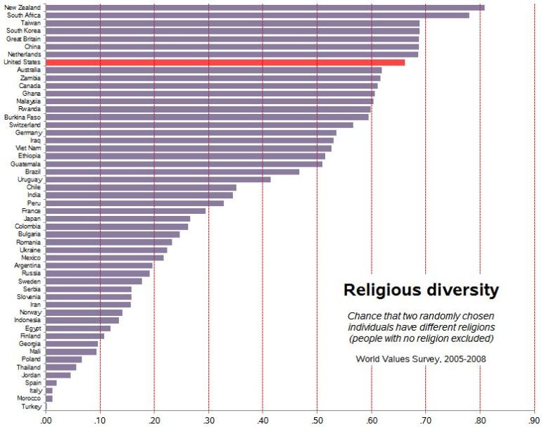 The U.S. is quite diverse — .66 — but a number of countries rank higher.
Of course, the categories are important in this endeavor. For example, Turkey and Morocco are both 99% “Muslim.” So is Iraq, but in Iraq that population is divided between people who identify as Muslim, Shia and Sunni, so Iraq is much more diverse. You get the same effect by dividing up the Christians in the U.S., for example.
Increasing U.S. diversity
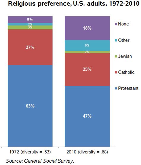
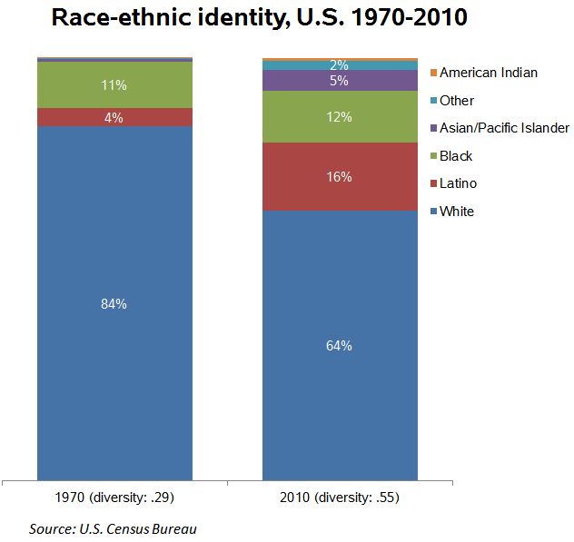
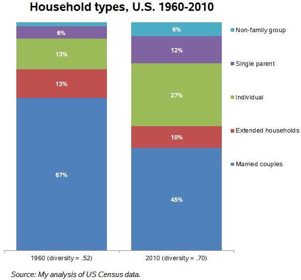
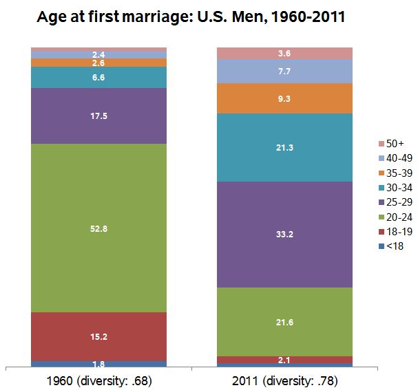
Anyway, back to describing the last half century in the U.S. On four important measures I’ve got easy-to-identify increasing diversity. What do you think of these (with apologies for the default Microsoft color schemes):
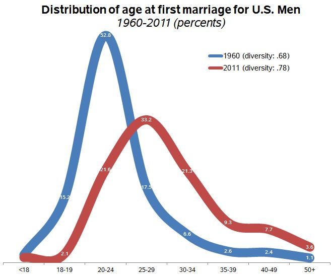
The last one is a little tricky. It’s common to report that the median age at marriage has increased since the 1950s (having fallen before the 1950s). But I realized it’s not just the average increasing, but the dispersion: More people marrying at different ages. So the experience of marriage is not just shifting rightward on the age distribution, but spreading out. Here’s another view of the same data:
These are corrected (5/11/2013) from the first version of this post. I have now calculated these using the this report from the National Center for Health Statistics for 1960, and comparing it with the 2011 American Community Survey for those married in the previous year.
I have complained before that using the 1950s or thereabouts as a benchmark is misleading because it was an unusual period, marked by high conformity, especially with regard to family matters. But it is still the case that since then diversity on a number of important measures has increased. Over the period of several generations, in important ways the people we randomly encounter are more likely to be different from ourselves (and each other).

Excellent post! I wonder if using the 1950s as a baseline downplays some of the important categorical distinctions. For example, before WWII, if anyone had used the term, racial diversity might have meant having neighbors who were Irish, Italian, and Jewish, all of whom were not exactly White. WWII had something of a homogenizing effect, blurring distinctions between old and new immigrant groups. Then, the last 50 years have seen increases in new immigrant groups, who are again marked as different. So, I guess I’m curious how we should interpret this diversity comparison. Is it supposed to be a summary measure of an average person’s experience of difference?
LikeLike
If the Census categories map the common cognitive experience then it would work that way. In some ways that doesn’t work – Asians who pay attention to differences in national origin are an obvious example.
LikeLike
It’s intuitively appealing to measure the probability of two random persons being of different groups, but there is the issue of how different the groups are. This is harder to quantify, but just as important. The difference might be measured using conflicts as a proxy, although I don’t expect that many sociologists would agree with that : )
LikeLike
I noticed that your first figure mentions “people of no faith excluded”. Wouldn’t that seem to create a bias reducing the religious diversity score for countries with a large population of atheists? (Though your inclusion of the “none” category in later figures seems to suggest that this is a data-source limitation).
On a completely different note, since gender issues tend to be the normal topic of this blog I’d be curious to hear your thoughts on the following (and its relation to inequality):
LikeLike
My graph of the US is from the General Social Survey, which has “none.” The World Values Survey seems to exclude those. I agree this is a bias, assuming there are different proportions of non-religious people in different countries.
LikeLike
I’m skeptical of this particular measure of diversity. Imagine a population with five religions, all equally represented. Compare to another population with ten religions, all equally represented. Intuitively, we would say that the second population is *twice as diverse* as the first. However, by this measure, they would be extremely similar – one with a value of 0.8 and the second a value of 0.9.
The “probability two randomly sampled individuals will be different” approach seems to work best when the two populations being compared have the same number of categories. However, when one population has more variants than the other, I’m unsure this number properly embodies our intuitive understanding of the word “diversity”.
LikeLike
Yes, it’s best for direct comparisons with the same number of categories. As you point out, there is a different upper value of diversity depending on the number of categories. Still, that interpretation still holds, so as long as you know what you’re measuring it may be useful. One adaptation I’ve used is to just rescale the index so that 0 is complete concentration and 1 is even distribution across the given categories. That might introduce other problems I haven’t thought of though.
LikeLike
These are great representations of data, and being able to “see” the numbers is often a great teaching aid. My question/concern is with representing Catholics and Protestants as two distinct religions. From an insider perspective (that is, someone in either community), that makes some sense. Although, if we believe any of the ‘culture wars’ discourse, that division becomes less salient, even from the insider view. Further and perhaps more importantly, taken from an outsider perspective, do Catholics and Protestants really look that different? Do Muslims, Jew, Hindus, and Buddhists (et al.) experience those two groups as truly distinct?
When we discuss equality and religion, especially in the US, we’re generally talking about the rights of Christians vs. non-Christians. Same goes for most of Europe. This of course reflects the sociological profile of who founded and still largely defines the policy of Western Europe, the US, and a good chunk of the Commonwealth. Granted, the historic divisions between Catholics and Protestants in Canada, the Netherlands, etc. are real, and matter. But do those divisions matter in the same way to religious minorities? Does “diversity” mean the same thing to all people? If you’re part of a minority religious community–especially in a secular state, I suspect not.
Nonetheless, very interesting data. Thanks!
LikeLike
Pity. Diversity is the end of any civilization. We will watch if your country proves an exception, though historical experience tells me otherwise.
LikeLike