If you don’t account for population growth, I don’t get what you’re saying with these employment numbers. I’ll show a simple example, but first a little rundown on Friday’s jobs report.
Here is how CNN Money played the jobs report:

What does it mean, this loss and gain of jobs, returning finally to where we started? Four paragraphs under that happy headline, CNN did points out:
Given population growth over the last four years, the economy still needs more jobs to truly return to a healthy place. How many more? A whopping 7 million, calculates Heidi Shierholz, an economist with the Economic Policy Institute.
So what does “Finally!” mean? The Wall Street Journal ran the headline, “Jobs Return to Peak, but Quality Lags.” On 538 it was, “Women returned to prerecession levels of employment in 2013. Men remain hundreds of thousands of jobs in the hole:”

The Center on Budget and Policy Priorities showed how much better the previous recoveries were:

That’s a good comparison. And CBPP mentioned population growth, too:
…payroll employment has finally topped its level at the start of the recession. Still, with essentially no net job growth since December 2007 but a growing working-age population, many more people today want to work but don’t have a job.
It’s not that no one mentions population growth, it’s that they still lead with the “top line” number. And they all have that horizontal line at the raw number of jobs when the recession started as the benchmark. I don’t know why.
Maybe in some crazy economics world the absolute number of jobs is what really matters for evaluating a recovery, and that explains the fixation on that horizontal line. From a social perspective what matters is the proportion of people with jobs. I could see the logic if you had a finite number of employers that never change, where you could literally count up the jobs at two points in time, and see who added and who subtracted from their payrolls (this is why retail chains report “same-store” trends, so the statistics aren’t confounded by the changing number of stores). But we have zillions of employers, constantly changing and moving around — largely in response to population changes. So that static image seems pointless.
In perspective
So here are some charts to put the recession and recovery in slightly better perspective. These all use the Bureau of Labor Statistics’ Current Population Survey from March 2003 to March 2013 (from IPUMS), the household survey used to track the labor force. I use ages 15 and older, and combine people in school (up to age 24) with those employed (not how most people do it, but a lot of people went to school, or stayed in school, because of the bad job market, and it doesn’t make sense to count them as not simply not employed). The survey excludes people in institutions, like prisons, and on-base military personnel.
To show the basic issue, here are the changes in the non-institutionalized population, age 15+, along with the number of them employed or in school — showing absolute changes relative to 2008, the peak employment year.

The 15+ population increased almost 12 million from 2008 to 2013. People employed or in school was not yet back to 2008 levels in March 2013. So a basic population adjustment is the least you can ask for (and we get that from the BLS with the employment-population ratio, which as of May was up less than one percent in the last 3.5 years, but it’s not the headline number).
What about age shifts? You don’t expect extreme age composition changes in 5 years, but there are different employment trends at different ages, so those affect how many employed people we are short. Here are the trends in work/school, by age and sex:

This makes it look like the 30-49s that are getting crushed. The 50+ community’s gains, however,are deceptive — their population is increasing. In fact, the population of people 30-49 declined 5% during this decade, while the population 50+ increased almost 30%. The younger people have increased their schooling rates, but their population has also grown. If you look at the employment/school rates, you see that among men, it is the younger groups that have done worst:
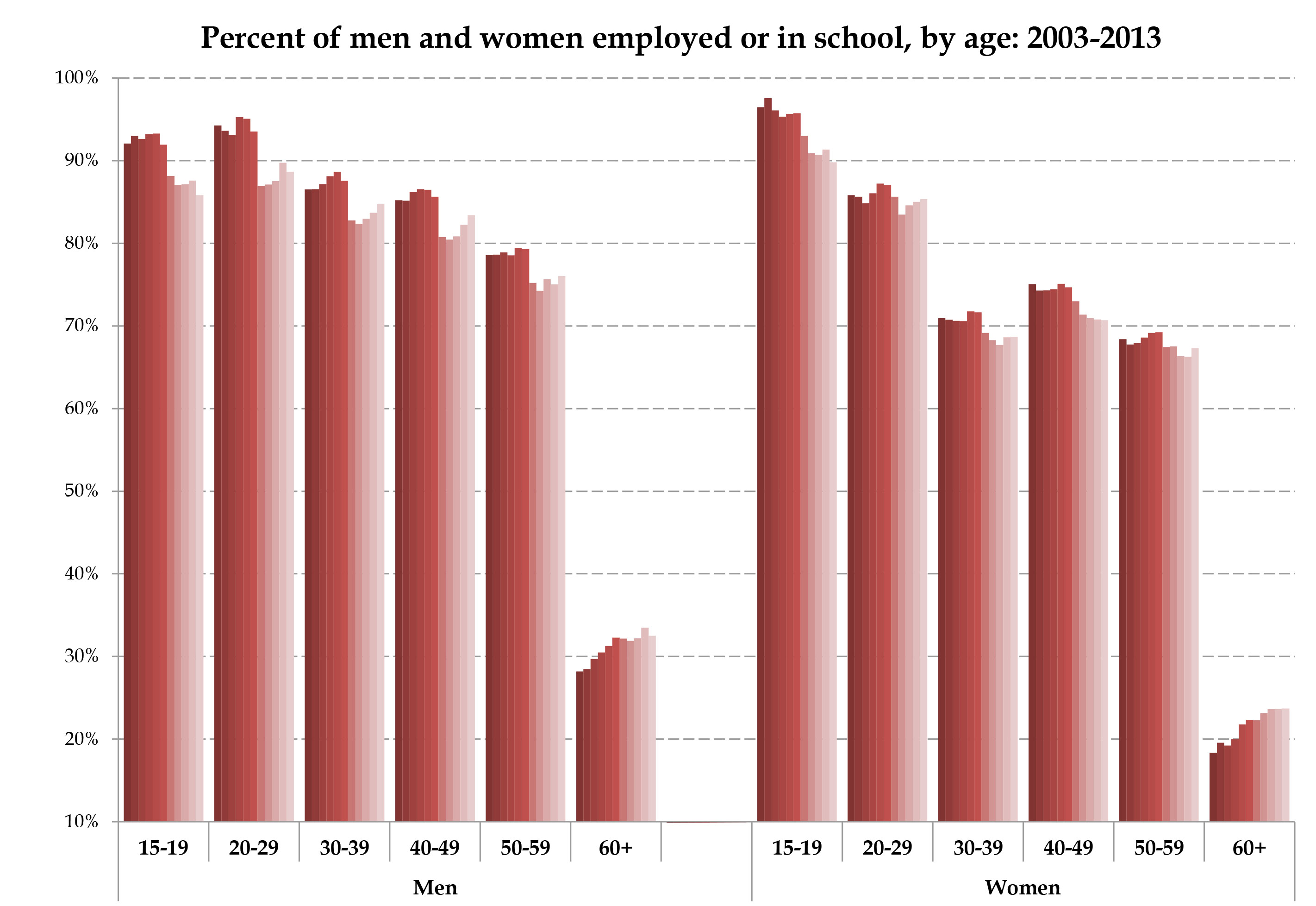
Women clearly are doing better (partly because in the 20-29 range they’re going to school more). It is amazing that employment rates didn’t fall at all over age 60. This could be because the population increase in that group is all in Baby Boomers just hitting their sixties, but I reckon it’s also people delaying retirement compensating for unemployment.
Now that we have age-specific work/school rates, and population changes, we can easily calculate how many people in each age group would have to be in work/school to get to the number implied by applying the peak-year 2008 rates to the population in each year. Sorry this one is so ugly: I made the last bar for each group pink to show the bottom line, where each group stands in 2013 relative to 2008:

Worst off are the 20-something men, down more than a million worker/students in 2013. Interestingly, women are only better off in the 20-something and 50+ ranges.
Finally, if you sum these figures you get the total, age-adjusted losses, by sex since 2008, as of March 2013:

And that’s your bottom line. The job/school losses stood at 3.3 million for men and 2.4 million for women as of March 2013.*
Really, there are no huge surprises here. In fact, the total population change is not a bad rough adjustment, especially for the short term. But there are some interesting nuances here. And with all the data and computers we have these days, let’s adjust for age and sex.
*I don’t say that’s how many “jobs” we need, because I don’t think “jobs” exist — are created, destroyed, shipped overseas, etc. I think there are employed people, people getting jobs, losing jobs, etc. I don’t see how a “job” exists absent a worker in it (and no, a listing is not a job until they fill it). So we don’t need to “create jobs” after a recession, what we need to do is “hire people.” Pet peeve.


Thanks for this analysis, Phil. May its points be absorbed into the public discourse. I was interested to see if there are geographic patterns to this so I worked up a crude map of the workforce changes from April 2007 to April 2014 using the raw census figures on labor force participation, and there do appear to be some clusters on the map. (Here: http://geocommons.com/maps/363456) Your piece also complements the charts in the NY Times from 5 June on industry-by-industry job changes: (Here: http://www.nytimes.com/interactive/2014/06/05/upshot/how-the-recession-reshaped-the-economy-in-255-charts.html) Nice contribution!
LikeLike
Thanks!
LikeLike
Not a word on what is causing population growth. Hint, it isn’t ‘natural’ growth endogenous to the US.
LikeLike
The cause of population growth isn’t relevant to the post, but that’s not true. For 2015 estimates, two-thirds of population growth in the US is natural increase (births>deaths), while one-third is immigration. Of the natural increase, 57% is Hispanic. So I guess if you were a racist who thinks all Hispanic natural growth is not “endogenous,” you could say 71% of population growth is either immigration or Hispanic natural growth. https://www.census.gov/population/projections/data/national/2012/summarytables.html
LikeLike
“if you were a racist”!
All he is saying is, if the deathly combination of Nafta (and Reaganite capitalism)->massive emigration from Mexico and Central America->family based immigration had not happened, the economic growth would have been aligned with population growth. That is an acceptable position in real world. You have thrown the race bomb to preempt any argument.
LikeLike