What is your age?
[SKIP TO THE END for a mystery-partly-solved addendum]
Normally when we teach demography we use population pyramids, which show how much of a population is found at each age. They’re great tools for visualizing population distributions and discussing projections of growth and decline. For example, consider this contrast between Niger and Japan, about as different as we get on earth these days (from this cool site):
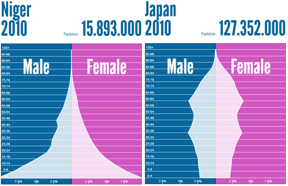
It’s pretty easy to see the potential for population growth versus decline in these patterns. Finding good pyramids these days is easy, but it’s still good to make some yourself to get a feel for how they work.
So, thinking I might make a video lesson to follow up my blockbuster total fertility rate performance, I gathered some data from the U.S., using the 2013 American Community Survey (ACS) from IPUMS.org. I started with 10-year bins and the total population (not broken out by sex), which looks like this:

There’s the late Baby Boom, still bulging out at ages 50-59 (born 1954-1963), and their kids, ages 20-29. So far so good. But why not use single years of age and show something more precise? Here’s the same data, but showing single years of age:

That’s more fine-grained. Not as much as if you had data by months or days of birth, but still. Except, wait: is that just sample noise causing that ragged edge between 20 and about 70? The ACS sample is a few million people, with tens of thousands of people at each age (up age 75, at least), so you wouldn’t expect too much of that. No, it’s definitely age heaping, the tendency of people to skew their age reporting according to some collective cognitive scheme. The most common form is piling up on the ages ending with 0 and 5, but it could be anything. For example, some people might want to be 18, a socially significant milestone in this country. Here’s the same data, with suspect ages highlighted — 0’s and 5’s from 20 to 80, and 18:

You might think age heaping results from some old people not remembering how old they are. In the old days rounding off was more common at older ages. In 1900, for example, the most implausible number of people was found at age 60 — 1.6-times as many as you’d get by averaging the number of people at ages 59 and 61. Is that still the case? Here it is again, but with the red/green highlights just showing the difference between the number of people reported and the number you’d get by averaging the numbers just above and below:
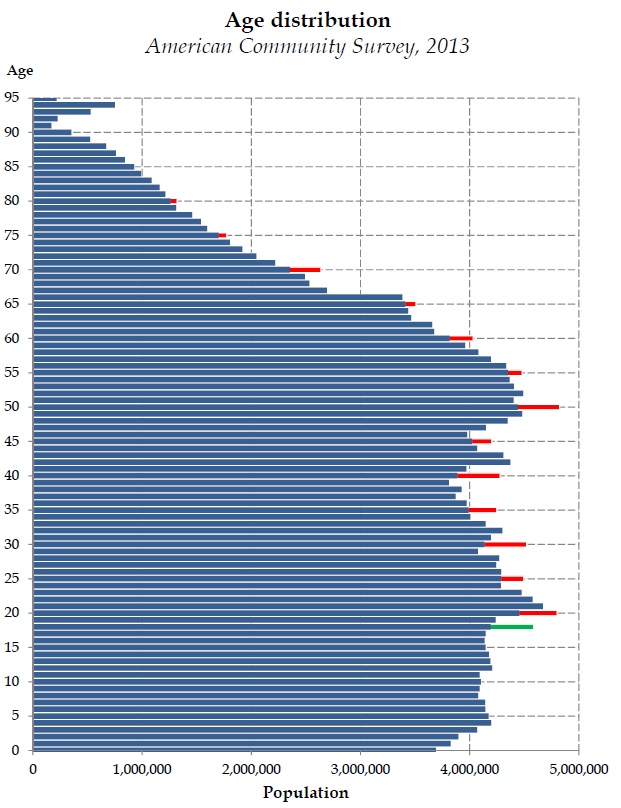 Proportionately, the 70-year-olds are most suspicious, at 10.8% more than you’d expect. But 40 is next, at 9.2%. And that green line shows extra 18-year-olds at 8.6% more than expected.
Unfortunately, it’s pretty hard to correct. Interestingly, the American Community Survey apparently asks for both an age and a birth date:

If you’re the kind of person who rounds off to 70, or promotes yourself to 18, it might not be worth the trouble to actually enter a fake birth date. I’m sure the Census Bureau does something with that, like correct obvious errors, but I don’t think they attempt to correct age-heaping in the ACS (the birth dates aren’t on the public use files). Anyway, we can see a little of the social process by looking at different groups of people.
Up till now I’ve been using the full public use data, with population weights, and including those people who left age blank or entered something implausible enough that the Census Bureau gave them an age (an “allocated” value, in survey parlance). For this I just used the unweighted counts of people whose answers were accepted “as written” (or typed, or spoken over the phone, depending on how it was administered to them). Here are the patterns for people who didn’t finish high school versus those with a bachelor’s degree or higher, highlighting the 5’s and 0’s (click to enlarge):
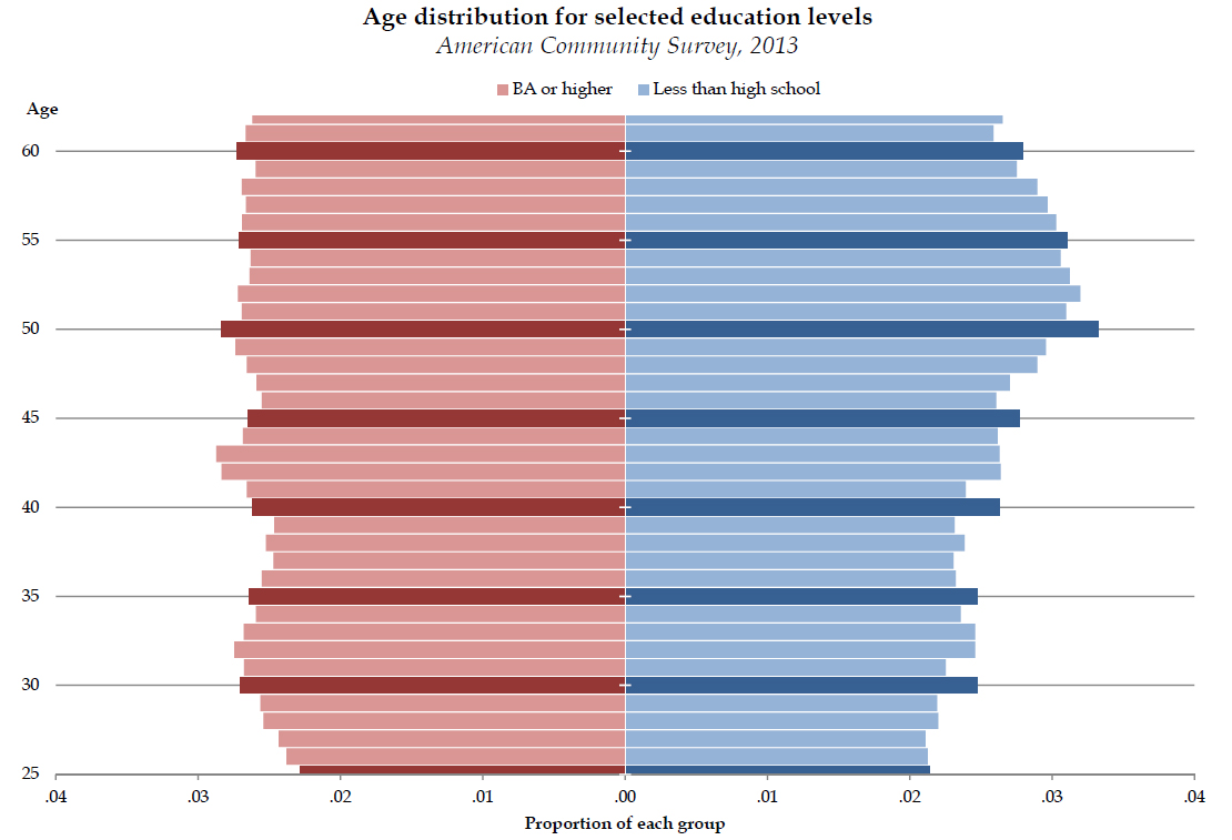
Clearly, the age heaping is more common among those with less education. Whether it’s really people forgetting their age, rounding up or down for aspirational reasons, or having trouble with the survey administration, I don’t know.
Is this bad? As much as we all hate inaccuracy, this isn’t so bad. Fortunately, demographers have methods for assessing the damage caused by humans and their survey-taking foibles. In this case we can use Whipple’s index. This measure (defined in this handy United Nations slideshow) takes the number of people whose alleged ages end in 0 or 5 and multiplies that by 5, then compares it to the total population. Normally people use ages 23 to 62 (inclusive), for an even 40 years. The amount by which people reporting ages 25, 30, 35, 40, 45, 50, 55, and 60 are more than one-fifth of the population ages 23-62, that’s your Whipple’s index. A score of 100 is perfect, and a score of 500 means everyone’s heaped. The U.N. considers scores under 105 to be “very accurate data.” The 2013 ACS, using the public use file and the weights, gives me a score of 104.3. (Those unweighted distributions by education yield scores of 104.0 for high school dropouts and 101.7 for college graduates.) In contrast, the Decennial Census in 2010 had a score of just 101.5 by my calculation (using table QT-P2 from Summary File 1). With the size of the ACS, this difference shouldn’t have to do with sampling variation. Rather, it’s something about the administration of the survey.
Why don’t they just tell us how old they really are? There must be a reason.
Two asides:
- The age 18 pattern is interesting — I don’t find any research on desirable young-adult ages skewing sample surveys.
- This is all very different from birth timing issues, such as the Chinese affinity for births in dragon years (every twelfth year: 1976, 1988…). I don’t see anything in the U.S. pattern that fits fluctuations in birth rates.
Mystery-partly-solved addendum
I focused one education above, but another explanation was staring me in the face. I said “it’s something about the administration of the survey,” but didn’t think to check for the form of survey people took. The public use files for ACS include an indicator of whether the household respondent took the survey through the mail (28%), on the web (39%), through a bureaucrat at the institution where they live (group quarters; 5%), or in an interview with a Census worker (28%). This last method, which is either a computer-assisted telephone interview (CATI) or computer-assisted personal interview (CAPI), is used when people don’t respond to the mailed survey.
It turns out that the entire Whipple problem in the 2013 ACS is due to the CATI/CAPI interviews. The age distributions for all of the other three methods have Whipple index scores below 100, while the CATI/CAPI folks clock in at a whopping 108.3. Here is that distribution, again using unweighted cases:

There they are, your Whipple participants. Who are they, and why does this happen? Here is the Bureau’s description of the survey data collection:
The data collection operation for housing units (HUs) consists of four modes: Internet, mail, telephone, and personal visit. For most HUs, the first phase includes a mailed request to respond via Internet, followed later by an option to complete a paper questionnaire and return it by mail. If no response is received by mail or Internet, the Census Bureau follows up with computer assisted telephone interviewing (CATI) when a telephone number is available. If the Census Bureau is unable to reach an occupant using CATI, or if the household refuses to participate, the address may be selected for computer-assisted personal interviewing (CAPI).
So the CATI/CAPI people are those who were either difficult to reach or were uncooperative when contacted. This group, incidentally, has low average education, as 63% have high school education or less (compared with 55% of the total) — which may explain the association with education. Maybe they have less accurate recall, or maybe they are less cooperative, which makes sense if they didn’t want to do the survey in the first place (which they are legally mandated — i.e., coerced — to do). So when their date of birth and age conflict, and the Census worker tries to elicit a correction, maybe all hell breaks lose in the interview and they can’t work it out. Or maybe the CATI/CAPI households have more people who don’t know each other’s exact ages (one person answers for the household). I don’t know. But this narrows it down considerably.


Any differences by gender? I’d guess there’s heaping for both men and women, but women are more likely to round down and men to round up.
LikeLike
Phil – Interesting as always. I notice that for age heaping at 45 and above the net population deficit is in the older categories, but for age 40 and below it is in the younger. To the extent that aspirational processes are at work they seem to shift from upward to downward at age 40-45.
I am by the way 55 and was born in 1957.
LikeLike
I’m sorry, Don: in the ACS everyone born in 1957 was 56 is 2013. Everyone. (In the PUMS anyway.)
LikeLike
Don, you don’t look a day over 54!
LikeLike
…there’s also a difference in setting, very simply: it’s a different thing telling a stranger (official) over the phone or to their face how old you are exactly, rather than filling out a form. And computer-assisted phone surveys… I suspect most people find it easier to lie / adjust the facts to a computer voice than to lie in writing. Just my take on the thing.
LikeLike
Hello,
Thanks for this!
Just one comment: you say that your pyramids are based on answers given by one member of the household for all the others (i.e. mostly proxi answers). I would say that this could be explored more in detail. Indeed there is certainly a difference in quality between “main” respondent and proxis’ ages. Is there hipping on the age of the “real respondents” or is it on the age of the proxis? Do we know the age range of the main respondents, their activity (student, etc.)? Does the hipping depend on whether a parent or a child was answering?
This also fits the idea that if a household member fills the web questionnaire, he can ask around for the age of his family members if he can’t remember it, or it’s done by a family member who has a good catch on these things (=better quality). If somebody answers by phone or opens the door, he is more likely to be by himself (second round), has less time to recalculate the ages mentally from the year of birth, etc (=poorer quality).
LikeLike