Yesterday I wondered about the treatment of race in the blockbuster Chetty et al. paper on economic mobility trends and variation. Today, graphics and representation.
If you read Brad Wilcox’s triumphalist Slate post, “Family Matters” (as if he needed “an important new Harvard study” to write that), you saw this figure:
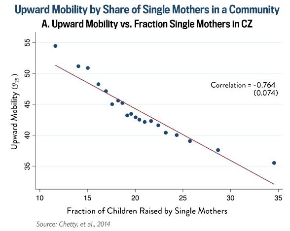
David Leonhardt tweeted that figure as “A reminder, via [Wilcox], of how important marriage is for social mobility.” But what does the figure show? Neither said anything more than what is printed on the figure. Of course, the figure is not the analysis. But it is what a lot of people remember about the analysis.
But the analysis on which it is based uses 741 commuting zones (metropolitan or rural areas defined by commuting patterns). So what are those 20 dots lying so perfectly along that line? In fact, that correlation printed on the graph, -.764, is much weaker than what you see plotted on the graph. The relationship you’re looking at is -.93! (thanks Bill Bielby for pointing that out).
In the paper, which presumably few of the people tweeting about it read, the authors explain that these figures are “binned scatter plots.” They broke the commuting zones into equally-sized groups and plotted the means of the x and y variables. They say they did percentiles, which would be 100 dots, but this one only has 20 dots, so let’s call them vigintiles.
In the process of analysis, this might be a reasonable way to eyeball a relationship and look for nonlinearities. But for presentation it’s wrong wrong wrong.* The dots compress the variation, and the line compresses it more. The dots give the misleading impression that you’re displaying the variance around the line. What, are you trying save ink?
Since the data are available, we can look at this for realz. Here is the relationship with all the points, showing a much messier relationship, the actual -.76 (the range of the Chetty et al. figure, which was compressed by the binning, is shown by the blue box):
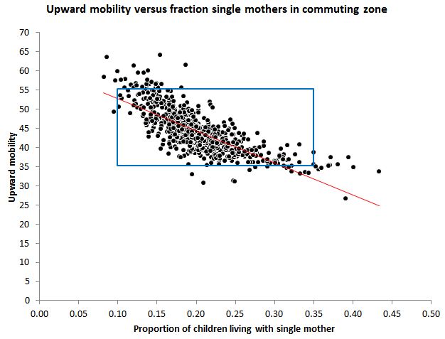 That’s 709 dots — one for each of the commuting zones for which they had sufficient data. With today’s powerful computers and high resolution screens, there is no excuse for reducing this down to 20 dots for display purposes.
But wait, there’s more. What about population differences? In the 2000 Census, these 709 commuting zones ranged in population in the 2000 Census from 5,000 (Southwest Jackson, Utah) to 16,000,000 (Los Angeles). Do you want to count Southwest Jackson as much as Los Angeles in your analysis of the relationship between these variables? Chetty et al. do in their figure. But if you weight them by population size, so each person in the population contributes equally to the relationship, that correlation that was -.76 — which they displayed as -.93 — is reduced to -.61. Yikes.
Here is what the plot looks like if you scale the commuting zones according to population size (more or less, not quite sure how Stata does this):
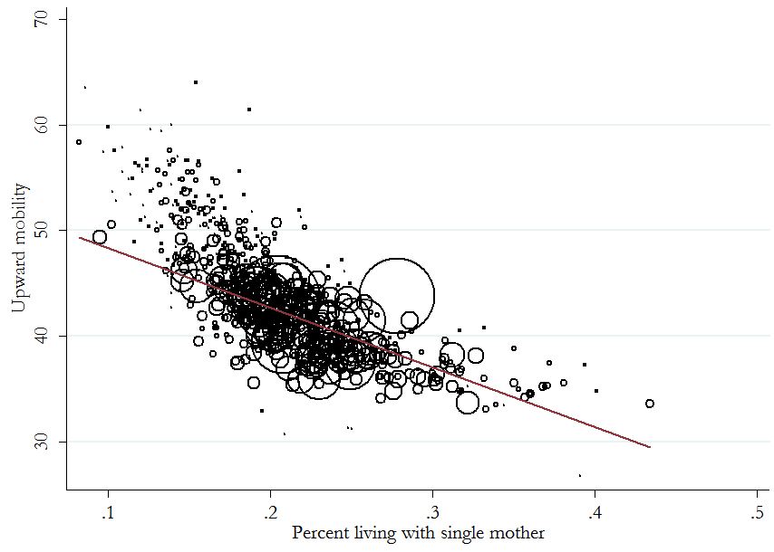
Now it’s messier, and the slope is much less steep. And you can see that gargantuan outlier — which turns out to be the New York commuting zone, which has 12 million people and with a lot more upward mobility than you would expect based on its family structure composition.
Finally, while we’re at it, we may as well attend to that nonlinearity that has been apparent since the opening figure. We can increase the variance explained from .38 to .42 by adding a quadratic term, to get this:

I hate to go beyond what the data can really tell. But — what the heck — it does appear that after 33% single-mother families, the effect hits its minimum and turns positive. These single mother figures are pretty old (when Chetty et al.’s sample were kids). Now that the country has surpassed 40% unmarried births, I think it’s safe to say we’re out of the woods. But that’s just speculation.**
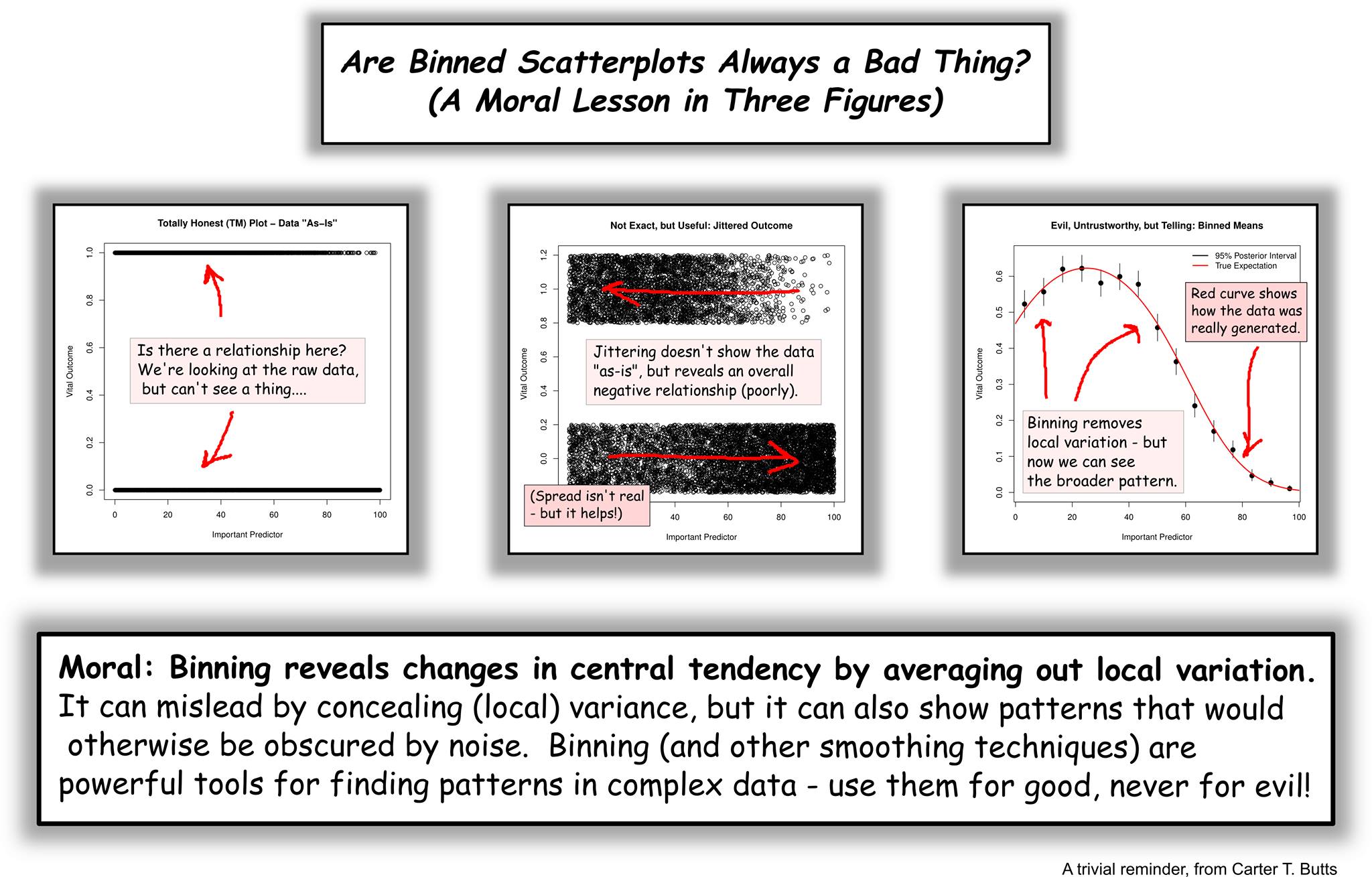
*OK, OK: “wrong wrong wrong” is going too far. Absolute rules in data visualization are often wrong wrong wrong. Binning 709 groups down to 20 is extreme. Sometimes you have a zillion points. Sometimes the plot obscures the pattern. Sometimes binning is an inherent part of measurement (we usually measure age in years, for example, not seconds). None of that is an excuse in this case. However, Carter Butts sent along an example that makes the point well:
On the other hand, the Chetty et al. case is more similar to the following extreme example:
If you were interested in the relationship between age and earnings for a sample of 1,400 full-time, year-round women, you might start with this, which is a little frustrating:
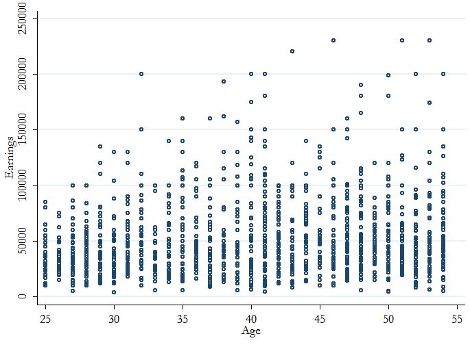
The linear relationship is hard to see, but it’s about +$500 per year of age. However, the correlation is only .13, and the variance explained by linear-age alone is only 1.7%. But if you plotted the mean wage over ages, the correlation jumps to .68:
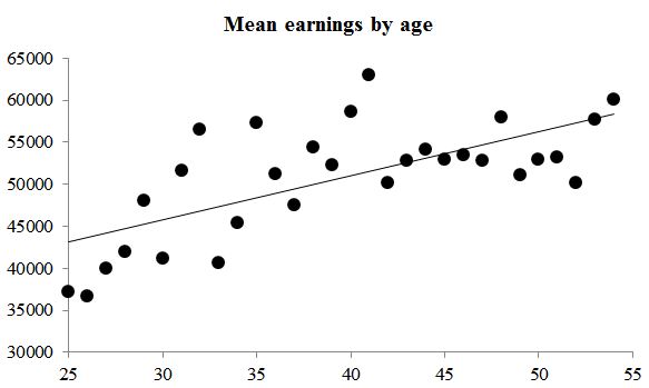
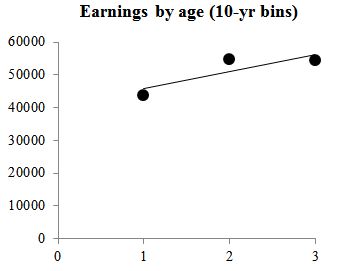
That’s a different question. It’s not, “how does age affect earnings,” it’s, “how does age affect mean earnings.” And if you binned the women into 10-year age intervals (25-34, 35-44, 45-54), and plotted the mean wage for each group, the correlation is .86.
Chetty et al. didn’t report the final correlation, but they showed it, even adding the regression line, so that Wilcox could call it the “bivariate relationship.”
**This paragraph was a joke that several people missed, so I’m clarifying. I would never draw a conclusion like that from the scraggly tale of a loose correlation like this.


Good point Phillip. How much do Chetty et al rely on econometrics? Don’t they have to construct alot of instrumental variables because the dataset they are using is by its very nature parsimonious – no race, gender etc that you would find in a sociological survey? The problem I have with these quasi-experimental methods is that its hard enough to design accurate models and tease out causation with traditional controlled survey methods. Quasi-experiments are by their nature just abstractions and it seems their use by economists are premised on some dubious assumptions about human rationality and economic reductionism that assumes human behavior can be captured by econometric models.
Have the critiques of David Sheppard over 20 years ago ever been refuted?
LikeLike
“…it does appear that after 33% single-mother families, the effect hits its minimum and turns positive.”
No, it doesn’t. This is an unfortunate example of yet another way that one could misrepresent the available data. The apparent upturn is entirely an artifact of the arbitrary (and clearly very wrong) assumption of a quadratic relationship — i.e., that the slope must change at a constant rate. There is a clear non-linearity, but there’s no evidence in the data of any upturn at higher x values. The cluster of all-negative residuals at x > .35 is an important clue that a quadratic curve is not a good description of the underlying social relationship.
LikeLike
I know. I guess it wasn’t obvious I was kidding on that last point.
LikeLike
Not obvious at all, given the earnest tone of everything else. But I guess we agree.
LikeLike
Given the serious nature of this contribution (I was led to believe quadratic dependency is true), the last paragraph should be removed. If anything, you have demonstrated the opposite of what you intended, increase in percentage of single mother-led families reduce inter generational mobility, not that I believe an upward mobility of 40 is bad.
LikeLike
They ignore the genetics. Given that evey human trait is heritable (with a rule of thumb 50/50 nature/nurture), that’s serious error. In fact, the same genetic trait could predispose people to both marry and to have better chances in social mobility. They should do an analysis on adopted children, for example.
LikeLike
Where are you getting all these? 50/50 nature/nurture?
The reference to go to is
Vinkhuyzen, Anna AE, et al. “Estimation and Partitioning of Heritability in Human Populations Using Whole Genome Analysis Methods.” Annual review of genetics 47.1 (2013).
Trait Heritability
Height 0.8
BMI 0.45-0.8
Bone Mineral density 0.61
Intelliogence of children 0.5/
LikeLike
That reply was cut off in the middle; continuing,
Trait Heritability
Intelligence of adults 0.8
RBC Haemoglobin 0.84
Personality (extraversion) 0.34-0.7
By heritability I mean to refer to the proportion of the variation in the trait within the population which can be explained by variation of genes within the population.You can se Heritability is > 0.5 for most traits.
LikeLike
Vijay this is to understand as rule of thumb, as if “if you don’t know heritabilit of some human trait, no matter physical or psychological, assume it’s 50/50”, and not as accurate statement. In fact if you know the heritabilities for adults for iq are 0.8, then I assume you are familiar with the literature to know that heritabilities are somewhat lower in very low classes, and that for some traits heritabilities are lower for 50%. (e.g. risk for Parkinson disease is 25-30%, Asthma about 30% etc)
LikeLike